
The Tyranny of Terrazzo: How Minimalist Branding Became a Tool of Aesthetic Gentrification
A critical interrogation of the hegemonic violence embedded within the sans-serif, muted-pastel visual regimes of late-stage capitalism, and a call for the immediate formation of a federal agency to decolonize the corporate aesthetic.

Before we commence this exegesis, it is incumbent upon us to acknowledge that this critique is being formulated on the unceded ancestral lands of the Lenape people. We hold this space with reverence and extend our solidarity to all Indigenous communities navigating the ongoing violences of settler-colonial logics.
**Content Warning:** This text engages with potentially activating discussions of systemic erasure, aesthetic violence, cultural appropriation, neoliberal visuality, and the weaponization of negative space. Please proceed with radical self-care.
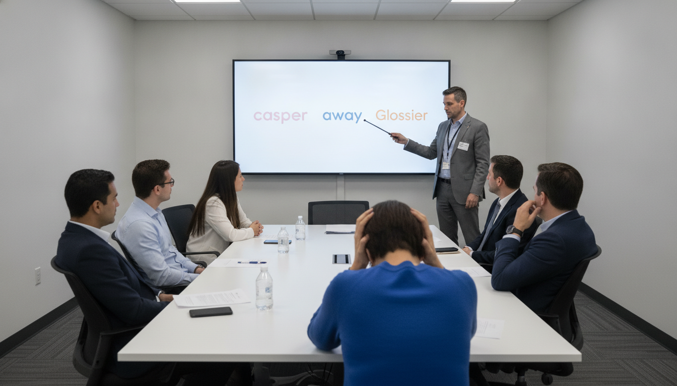
We find ourselves ensnared within a crisis of semiotic homogeneity. A cursory scroll through the digital marketplaces of our carceral-capitalist society reveals a deeply problematic visual consensus. From the frictionless non-places of Away’s luggage to the sterile wellness-scapes of Hims & Hers, we are being subjected to a relentless campaign of aesthetic whitewashing. This phenomenon, colloquially termed ‘blanding,’ is not a benign trend of market convergence; it is an act of epistemic violence, a deliberate project of cultural erasure masquerading as ‘good design.’
This hegemonic minimalism, arguably perfected and evangelized into a global dogma by designers like Jony Ive during his tenure at Apple, privileges a specific, Eurocentric, and profoundly classed notion of ‘cleanliness.’ The obsession with sans-serif typography, muted earth tones, and expansive negative space is a direct semiotic descendant of colonialist ideologies that equated ornamentation, color, and complexity with the ‘primitive’ and ‘uncivilized.’ Every Casper mattress advertisement, with its palette of beige and millennial pink, perpetuates a narrative wherein taste is defined by the conspicuous absence of cultural signifiers. It is the visual equivalent of a gentrified neighborhood, where vibrant, historically rich murals are power-washed into oblivion to make way for a sterile, grey facade housing an artisanal toast bar.
This is not mere hyperbole; it is a material reality. When a corporation chooses a bland, inoffensive aesthetic, it is making a violent choice to erase and marginalize. It is a microaggression scaled to the macro level, a silent declaration that the rich, maximalist, and polyvocal aesthetics of Black, Indigenous, and other global majority cultures are not ‘marketable,’ not ‘clean,’ not ‘modern.’ The visual language of a brand is a site of power, and what we are witnessing is the totalizing colonization of our visual field by a single, oppressive narrative of value.
To counter this insidious trend, performative consumer choice is insufficient. We cannot simply ‘buy diverse’ when the entire aesthetic framework is rigged. Therefore, we must demand immediate and decisive institutional intervention. I propose the establishment of the Department of Aesthetic Equity and Representational Justice (DAERJ), a federal body tasked with dismantling these oppressive visual systems.
The DAERJ’s mandate would be threefold:
1. **Aesthetic Impact Audits:** Corporations with revenues exceeding $50 million must submit their branding and marketing materials for a compulsory audit to assess their level of cultural inclusivity. A federally standardized ‘Pantone Inclusivity Score’ (PIS) will be assigned, with penalties for failing to represent a sufficiently decolonized color palette.
2. **Typographical Reparations:** A portion of corporate tax revenue will be redirected into a fund to support designers and typographers from historically marginalized communities, specifically for the creation and proliferation of non-Latin, non-Eurocentric font families for commercial use.
3. **Mandated Maximalism:** Introduce quotas requiring a minimum percentage of brands in any given market sector to adopt maximalist, patterned, or otherwise culturally specific design languages, ensuring that the visual landscape reflects the true intersectional diversity of our society.
To resist the tyranny of the sans-serif is to engage in a radical act of decolonization. We must challenge the placid surfaces of neoliberal branding and demand a visual culture that is as complex, vibrant, and beautifully dissonant as the communities it claims to serve. It is time to reclaim our visual field from the clutches of beige.
Reader Discussion (9)
A federal 'Department of Aesthetic Equity'? You have to be kidding me. My clients choose minimalism because it's clean, legible, and converts well on mobile, not because they're engaging in 'epistemic violence.' This is what happens when academics who've never had to meet a payroll try to talk about branding.
First they came for our gas stoves, now they're coming for our sans-serif fonts. This is the most distilled version of leftist insanity I've ever seen. A 'Pantone Inclusivity Score' is just a social credit score for businesses.
To attribute this entire trend to Jony Ive is a bit reductive. The principles of minimalism and 'cleanliness' in design have deep roots in the Bauhaus school and the International Typographic Style of the 50s. This isn't a new phenomenon, though its corporate weaponization certainly feels contemporary.
Finally, a cogent analysis of the violent semiotics of neoliberal branding. The author perfectly articulates how negative space is weaponized to perpetuate colonialist erasure. The DAERJ is a necessary step towards true representational justice in the visual field.
Is this a real problem? I just bought a grey suitcase because I thought it looked nice. Not everything has to be a giant political statement, some people just like things that are simple.
This isn't about colonialism, it's about cost. A minimalist brand is cheaper to design, easier to trademark, and can be slapped on anything from a website to a pencil without modification. It's the cheapest path to the broadest, most inoffensive market share.
Yeah I hate that terrazzo flooring, reminds me of my old high school cafeteria. Always looked dirty and cold. It's amazing they're still putting that stuff in buildings.
You want to talk about tyranny? How about the tyranny of inflation and illegal immigration? The government wants to create a whole new department to police colors while the border is wide open.
I read three paragraphs and I still have no idea what 'carceral-capitalist society' means but I know it's dumb. This is why people hate the media. Just write normal.